CSS Flex-Box Easy-way
In this blog, we are going learn easy flexbox techniques that you should absolutely learn while applying CSS in the beginning stage over any container

I am a developer from India, passionate about the cross platform applications development.
Flex-Box
This is the most underrated display property that we almost avoid learning at beginning stage of learning CSS. I remember, when I saw the first time a website contains an amazing Top Navbar with different navigation icons, shrinking down the page would wrap up the icons into hamburger icon.
I wanted to make that same thing in my personal project. But I always failed to understand how can I shift the all icons to the row format one by one. I tried to give padding from different sides but it didn't work well. Then I randomly found some of the property in order to take place all the items in a single row with custom space. Then I learned about this property:
 .container{

          display: flex,
          flex-direction: row,
          justify-content: space between,

    }
this particular code snippet actually made my life easier, Whenever I think to make a Top/Bottom Nav bar I generally prefer the display: flex property, as it's easy to implement and we can use it in any of the containers just wrapping down all the elements in a single container.
Here I am attaching a code snippet that you can refer for making NavBar in your Project 👇
HTML
index.html
<!DOCTYPE html>
<html lang="en">
<head>
    <meta charset="UTF-8">
    <meta http-equiv="X-UA-Compatible" content="IE=edge">
    <meta name="viewport" content="width=device-width, initial-scale=1.0">
    <title>My Own Nav Bar</title>
    <link rel="stylesheet" href="style.css">
</head>
<body>
    <div class="container">
        <div class="icons">Home</div>
        <div class="icons">Service</div>
        <div class="icons">Work</div>
        <div class="icons">About Us</div>
    </div>
</body>
</html>
CSS
style.css
*{
    padding: 0;
    margin: 0;
}

.container{
    display: flex;
    flex-direction: row;
    justify-content: space-around;
    margin-top: 10px;
    background: rgba(7, 6, 8, 0.826);
    padding-top: 20px;
    padding-bottom: 20px;
    font-size: 20px;
    font-family: 'Gill Sans', 'Gill Sans MT', 'Calibri', 'Trebuchet MS', 'sans-serif';
    font-weight:100;
    color: white;
}
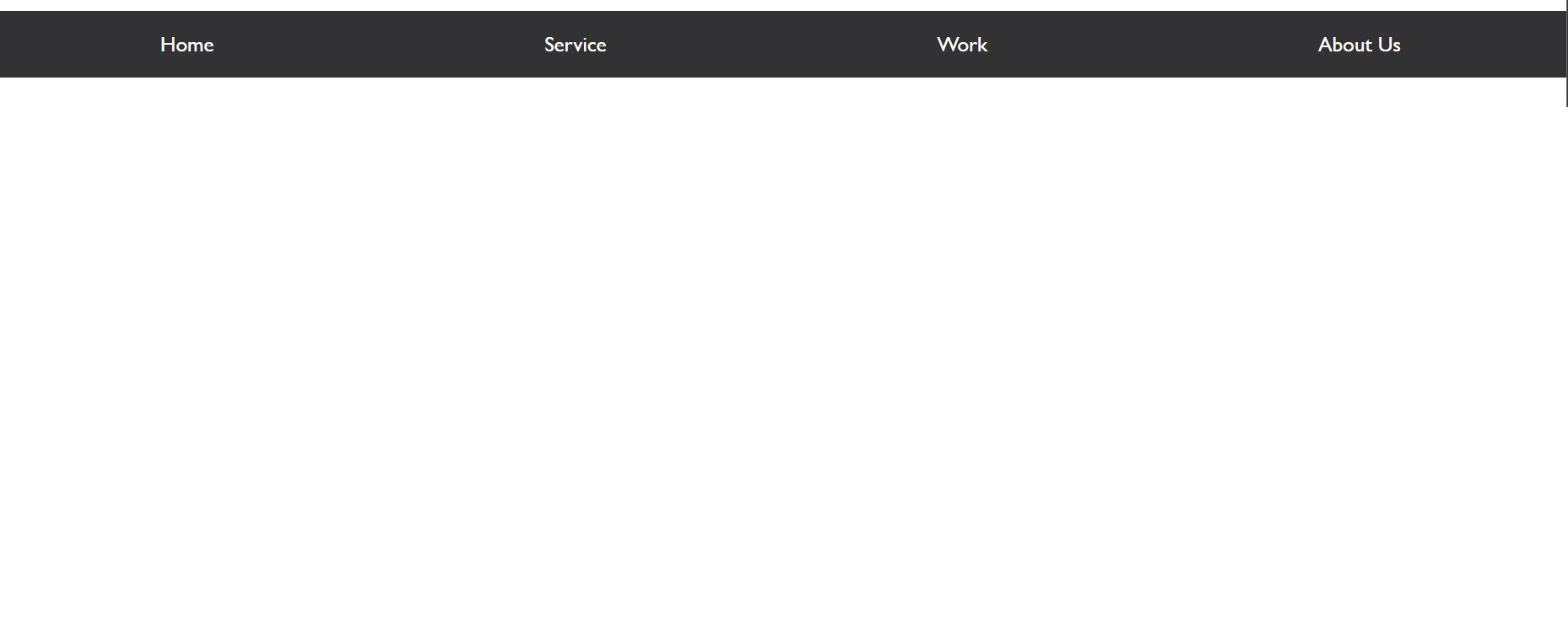
After putting the code into the playground the final result looks like this :
Try it yourself to boost confidence in your first UI design
I hope this beginner-friendly guide will help you to make the foremost top component of any webpage layout.
